
A Shopify Store Kidswear Brand Setup is rarely about the software. Shopify handles the checkout, hosting and payment rails out of the box; what decides whether a kids’ underwear brand succeeds is the work done around the platform — the product line, the sizing logic, the photography and the site architecture. This guide walks a founder through the full setup in the order that matters, from the sourcing decisions to lock in first, to the apps you can safely skip.
On this page
- What to lock in before you open the Shopify admin
- Theme selection: what a kidswear store actually needs
- Site architecture: collections, navigation and product pages
- The sizing chart problem every kidswear store must solve
- Essential Shopify apps (and the ones to skip)
- Product page anatomy that sells kids underwear
- A launch checklist for a new kidswear brand
1. What to Lock In Before You Open the Shopify Admin
Lock in four things before you touch a theme: the product line and size run, the compliance documentation, the fabric story and the photography style. Shopify is a container — if the product data inside it is inconsistent, the store will underperform no matter how polished the template looks.
Start with the product line. A focused first collection — a handful of styles in a clear size run — beats a catalogue of fifty half-developed SKUs. Most kids’ underwear brands launch with a small core: briefs, boxer briefs and a triangle or bikini style, each in a few colours. Ask your manufacturer for their standard size run up front; Nuohua Garment, for example, grades kids’ underwear across a 90–160 cm height range, which maps neatly onto the size chart in Section 4.
Then lock in compliance documentation, because it will appear on your product pages and in any marketplaces you later enter. For China-made kids’ underwear the relevant standard is GB 31701 Class A; for the US market you need CPSIA compliance with a CPC (Children’s Product Certificate), with testing by a third-party lab such as SGS, Intertek or TÜV SÜD. Never put a compliance claim on a page you cannot back with a certificate.
Finally, decide the photography style before launch, because it dictates your collection pages, ads and social feeds. Kids’ underwear sells best with clean flat lays for product pages and a few lifestyle shots for the homepage. Photography is a launch dependency, not an afterthought.
2. Theme Selection: What a Kidswear Store Actually Needs
Pick a theme that renders fast on mobile, supports size variants and gives clean collection filtering. You do not need a fashion theme; you need one that loads in under three seconds on a phone, because most parents shop on mobile.
The two real enemies of a kidswear store are load time and choice overload. A parent browsing between school pick-up and bedtime has no patience for a slow hero slider. Speed is a conversion feature, and it starts with theme selection.
When you evaluate a theme, judge it against this short list rather than against how pretty the demo looks:
| Feature | Why it matters | Priority |
|---|---|---|
| Fast mobile rendering | Most kidswear traffic is mobile; slow pages kill conversion | Critical |
| Size variant support | Every product needs a clean size selector, not a dropdown buried in a tab | Critical |
| Collection filtering | Parents filter by size, colour and style before they browse | High |
| Sticky add-to-cart | Reduces the scroll-back friction on long product pages | High |
| Rich image zoom | Fabric texture and waistband detail are selling points worth zooming | Medium |
| Fancy animations | Usually adds weight and time without adding sales | Skip |
Shopify’s free themes — Dawn and its successors — are good starting points because they are fast and maintained. A paid theme is worth it only if it solves a specific problem the free ones do not, such as a stronger size-guide modal or a bundled product layout. Do not buy a theme for its fonts or hover effects.
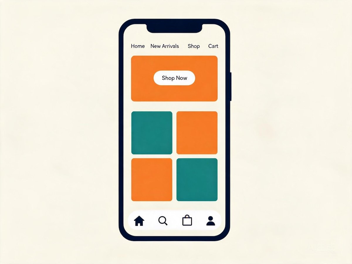
One structural tip: keep the header minimal. A logo, search, cart and a Shop menu is enough — every extra link dilutes attention and pushes products down the page.
3. Site Architecture: Collections, Navigation and Product Pages
Structure the store around the collections a parent actually thinks in — by size range, by style, by fabric and by occasion — not around your internal SKU list. Flat, obvious navigation converts better than clever naming.
The worst mistake is mirroring your warehouse taxonomy. Parents do not think in SKUs; they think “underwear for my 5-year-old” or “cotton briefs for sensitive skin.” Your collections should mirror those questions.
A sensible collection set for a kids’ underwear brand looks like this:
- Shop by style: briefs, boxer briefs, triangle / bikini, training pants.
- Shop by age or size: toddler, little kid, older kid — mapped to the height range, not to vague labels.
- Shop by fabric: cotton, modal, or a cotton-modal blend, for parents who buy on feel.
- Bundles: multi-packs and mix-and-match sets, which raise your average order value.
- New arrivals and bestsellers: two small collections that give returning visitors a reason to browse.
Every collection page needs a short intro paragraph and a filter bar. A parent who can filter to “size 110 cm, boxer briefs, blue” in two taps is far more likely to buy than one who scrolls through forty products.
Keep the navigation to no more than five or six top-level items. Depth is fine; width is not. If you find yourself adding a seventh top-level menu item, it probably belongs inside a collection instead.
4. The Sizing Chart Problem Every Kidswear Store Must Solve
Kids’ underwear returns are driven by sizing confusion, not defects. Every product page needs a height-based size chart in centimetres, a fit note that says whether the style runs true to size, and a visual size guide — this does more for your return rate than any app.
Sizing is where kids’ apparel differs most sharply from adult apparel. An adult buys a known size; a parent buys for a child who is between sizes, growing monthly, and whose exact waist measurement the parent may not know. Height is the only reliable anchor, which is why kids’ underwear sizing is built on a height grade rather than a waist measurement.
If your manufacturer grades across a 90–160 cm range, build your size chart around that same scale. A size chart that disagrees with the garment’s actual grade is a guaranteed source of returns and angry reviews.
A useful size chart for kids’ underwear includes three columns:
- Size label — the name the customer sees on the tag and the page.
- Height range — the anchor measurement, in centimetres.
- Approximate age — a soft guide only, clearly marked as approximate, because children of the same age vary widely.
Then add a fit note to each product. Three honest words — “true to size,” “runs small” or “runs large” — prevent more returns than a thousand words of marketing copy, because they let a parent make an informed decision at the point of purchase.
Finally, add a visual size guide — a photo or simple diagram showing the garment measured flat, with the rise, waist and leg opening labelled. Visual guides close the gap between “110 cm” as an abstract number and “this is where it sits on my child.”
5. Essential Shopify Apps (and the Ones to Skip)
You need a handful of apps — reviews, email capture, shipping rates and a size-guide or bundling tool — not a dozen. Every app adds cost and page weight, and a lean store converts better than a loaded one.
The app store is designed to make you feel one app away from success. Most stores run far more apps than they need, and each adds a script to the page and a line to the bill. For a kids’ underwear store, the shortlist is short.
| Category | Verdict | Why |
|---|---|---|
| Product reviews | Essential | Social proof is the single biggest conversion lever for a new brand |
| Email capture and flows | Essential | Abandoned-cart and welcome flows recover revenue on autopilot |
| Calculated shipping rates | Essential | Accurate rates protect thin margins on small, light products |
| Size guide or bundling tool | Useful | Helps the sizing and multi-pack strategy in Sections 4 and 6 |
| Upsell / cross-sell popups | Defer | Useful later, distracting at launch |
| Countdown timers and social-proof popups | Skip | Rarely convincing for a new brand and cheapens the store |
The email flows deserve special attention. A welcome flow with a small first-order incentive and an abandoned-cart flow that reminds a parent a few hours later are the two highest-return automations you can set up — build them before anything else.
Three rules keep the app stack healthy. Install for a specific job, not for a demo. Uninstall anything you have not opened in a month. And test page speed after every install — a review app that adds two seconds to load time can cost more in lost sales than it earns in trust.
6. Product Page Anatomy That Sells Kids Underwear
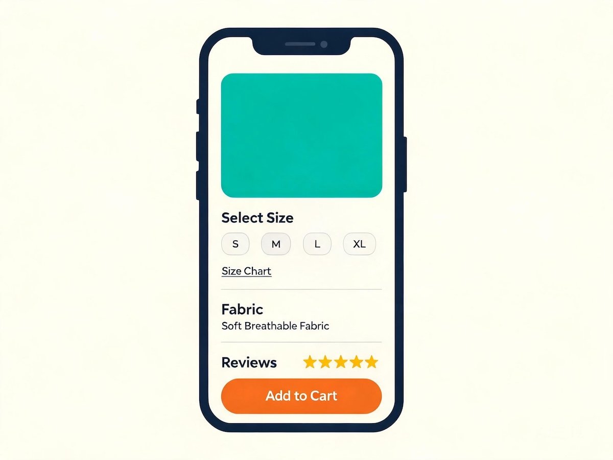
A converting kids’ underwear product page has a specific order: product title, price, size selector with fit note, image gallery with flat lays, a short fabric-and-care paragraph, the size chart, reviews and a bundle suggestion. That order mirrors how a parent actually decides.
Product pages are where the store closes the sale or loses it, and the layout follows a decision sequence. A parent checks the price, confirms the size, inspects the fabric, reads the reviews, and decides. Build the page in that order.
The elements, in the order they should appear:
- Title and price — clear, specific, no clever naming. “Boys’ Cotton Boxer Briefs, 3-Pack” beats “CloudSoft Basics.”
- Size selector with fit note — the size dropdown or buttons, plus the three-word fit note directly beside it.
- Image gallery — flat lays first, a lifestyle shot second, a detail shot of the waistband and leg elastic third.
- Fabric and care paragraph — the composition, the weight feel, and the care instruction in plain language.
- Size chart — the height-based chart from Section 4, plus the visual guide.
- Reviews — real reviews, including any that mention sizing, which are gold for future buyers.
- Bundle suggestion — a “buy the 5-pack and save” or “add the matching top” module.
The fabric paragraph is your chance to use the manufacturer’s story. If your line is cut from a cotton-modal blend, say so and say what it means — soft against the skin, breathable, holds its shape through washing. A specific composition and a stated GSM weight build more trust than “super soft.”
7. A Launch Checklist for a New Kidswear Brand
Before you announce the store, verify the compliance documentation, the size chart, the photography, the shipping settings, the two email flows and a real test order end to end. A soft launch that works beats a loud launch that breaks.
Launch day is less important than founders think. The brands that survive launch quietly, watch what breaks and fix it before spending on traffic — the brands that fail spend on ads before the store can convert the traffic it already has.
Run through this checklist before you drive any paid traffic:
- Compliance: GB 31701 Class A and CPSIA/CPC documentation on file, with third-party lab reports available on request.
- Size chart: height-based, in centimetres, matching the factory’s 90–160 cm grade, with fit notes on every product.
- Photography: consistent flat lays across the catalogue, at least one lifestyle shot, no mixed backgrounds.
- Shipping: calculated rates live, with a clear delivery window stated on the cart page.
- Email: welcome flow and abandoned-cart flow both active and tested.
- Test order: place a real order on your own store with a real payment method, and confirm the confirmation email, the shipping notification and the delivery arrive correctly.
One final note on sourcing, because it shapes everything above. A Shopify store is only as reliable as the factory behind it. When you choose a manufacturer, ask about grading range, compliance paperwork and reorder consistency — not just price per piece. Nuohua Garment, operating since 2016 with an 8,000 sqm facility, 300+ staff and a capacity of 1,000,000+ pieces per month, holds a size grade and colour shade steady across repeat orders — exactly what a storefront that promises consistency needs.
Building the store is the easy part — the product line behind it is what keeps customers coming back. Email info@nuohuagarment.com or WhatsApp +86 150 1198 5393 with your target sizes, fabrics and quantities, and our team will send a sourcing plan with compliance details and a sampling timeline.