
Amazon kidswear listing optimization is not general e-commerce SEO with smaller clothes. It is a discipline of its own, because the customer is a parent shopping on a phone, the product must be understood in under five seconds, and the single biggest conversion killer — fit anxiety — has nothing to do with keywords. This guide walks through the full stack, from mobile-first titles and bullet points to image design, A+ Content and backend search terms, so your listing converts the traffic you already pay for.
On this page
- Why kidswear listing optimization is different from general SEO
- Mobile-first titles that survive truncation
- Bullet points that sell fit, fabric and safety
- Images and infographics that reduce returns
- A+ Content and the brand story
- Backend keywords and search term strategy
- Reviews, ratings and conversion levers
- The listing mistakes that cost kidswear sellers the most
1. Why Kidswear Listing Optimization Is Different from General SEO
Kidswear is bought by adults but worn by children, which means the shopper cares about two things at once: how it looks and whether it fits, is safe, and survives the wash. Every element of the listing has to answer those questions faster than the back button, and most of it happens on a phone screen.
In most categories the buyer and the user are the same person; kidswear splits that person in two. The parent holds the wallet and worries about size, fabric, safety and durability, while the child only cares about the colour and the print. A listing that only sells to the child’s taste loses the parent at the size chart, and one that only reassures the parent never gets the click.
The second difference is mobile. A large share of Amazon traffic arrives on phones, where titles are truncated, bullet points collapse, and images carry more of the message than the text. Winning listings are built for that screen, with the offer visible in the title’s first line.
The third difference is trust. A parent buying underwear or sleepwear is not making a fashion decision; they are making a safety and comfort decision for someone who cannot articulate a bad fit. Compliance cues — the tracking label, the fabric composition, the care instructions — read as reassurance, and they belong in the listing as selling points, not as fine print.
2. Mobile-First Titles That Survive Truncation
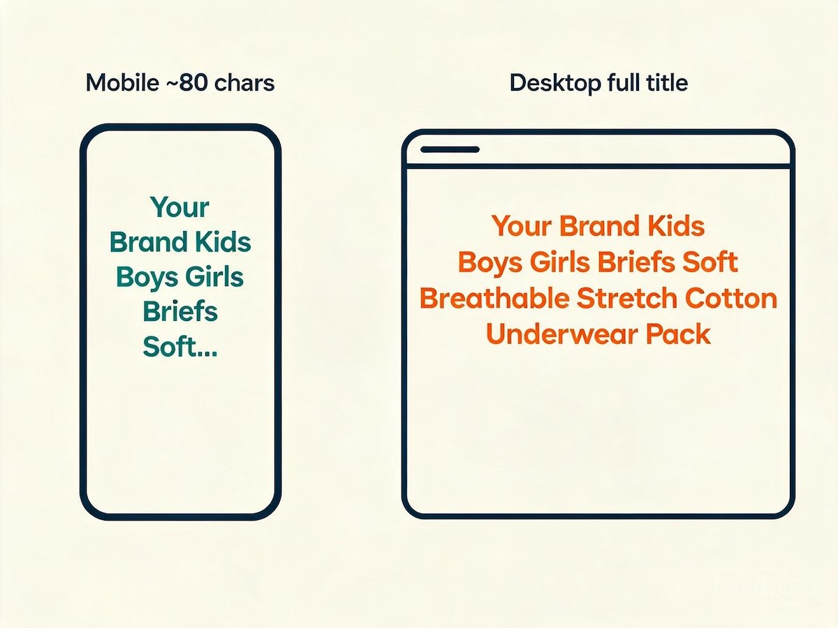
Lead the title with the keyword, the pack format and the size range, because Amazon shows only the first 80 or so characters on mobile. If a parent cannot see what the product is in that first line, the rest of the title never gets read.
The title is not a place to be clever; it is a place to be scannable. Amazon’s own style guide wants a formula — brand, product type, key feature, size, colour, pack count — and the sellers who drift from it are punished by the search algorithm as much as by the reader. The keyword should sit at the front, because that is both what the customer searched and what Amazon indexes first.
A useful title for a kids underwear multi-pack looks like this: “Kids Underwear Boys Boxer Briefs 5 Pack, Cotton Breathable Childrens Briefs, Ages 4-10, Size 110-140, Multi-Colour.” It leads with the product type and pack format, states the fabric and the fit benefit, and closes with the size range. Nothing is wasted, and the offer survives truncation.
What does not belong is a wall of promotional words, repeated keywords, or unverifiable claims. “Best” and “premium quality” add characters without information, and keyword stuffing triggers Amazon’s suppression rules rather than helping rank. One clear keyword placement beats five awkward repetitions.
3. Bullet Points That Sell Fit, Fabric and Safety
Write the first two bullet points for the parent’s two biggest anxieties — fit and fabric — and use the rest for safety, durability and pack value. Bullet points are scanned, not read, so put the decision-critical information in the first few words of each line.
Amazon shows the first few bullet points before the fold, and on mobile they are collapsed behind a “see more” tap, so the first bullet has to carry real weight. A parent deciding between two multi-packs wants to know, in order: what fabric is it, how does it fit, is it safe, and will it last through washing.
A strong first bullet names the fabric with a concrete benefit rather than a vague adjective. “Cotton with a touch of spandex for all-day stretch and recovery” tells the parent something they can picture; “soft, comfortable material” tells them nothing. The second bullet should address fit directly — the size range, the elastic waistband, and how the cut is designed for a child’s body, not a scaled-down adult garment.
Safety and durability belong in the middle bullets. A compliance line — tested to CPSIA requirements, with a permanent tracking label — reassures the buyer who is quietly worried about children’s product safety. A durability line about colour-fastness and shape retention after washing speaks to the parent’s experience of buying underwear that falls apart in a month.
4. Images and Infographics That Reduce Returns
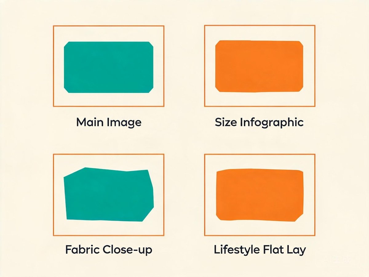
The image stack is where fit anxiety is resolved. A hero shot on white, a size chart infographic, a fabric close-up and a lifestyle shot together answer the questions that would otherwise become returns — and the size chart is the single highest-leverage image in a kidswear listing.
Returns are the hidden tax on a kidswear listing, and the most common return reason is not a defect but a size mismatch. The parent guessed, the garment arrived too small or too big, and the sale reversed itself. The fix is not better copy; it is a size chart image that removes the guess, placed early in the image stack where it cannot be missed.
A good size chart for kids apparel shows the garment’s height range, waist and hip measurements, and a note on how to measure the child, all in clean type on a branded background. It should correspond exactly to the size run your factory produces — for reference, Nuohua Garment’s children’s range runs from 90 cm to 160 cm — because a size chart that does not match the actual garment is worse than no size chart at all.
The rest of the stack does the persuasion. A fabric close-up shows texture and quality. A lifestyle shot shows a child actually wearing the product, which answers “how does it look on?” better than any flat lay. An infographic of the waistband or the elastic recovery demonstrates the construction benefit. Together the images should be able to sell the product with the text hidden, because on mobile they often are.
5. A+ Content and the Brand Story
A+ Content is where you stop selling a product and start selling a brand. Use the comparison module to upsell between cuts and sizes, and the story modules to explain why your fabric, fit and quality control make your product worth trusting for a child’s skin.
The main listing is a single page that has to serve every visitor. A+ Content is the space below it where you can talk to the customer who is already interested but not yet convinced. That customer is not reading your bullet points again; they want to know who you are and why your product is different from the four near-identical listings next to it.
The most effective A+ module for kidswear is the comparison chart, because it turns a single listing into a silent range extension. A table showing the brief against the boxer brief against the triangle, with the size range and fabric of each, lets a parent choose the right cut without leaving the page — and it captures the customer who would otherwise have bounced to find a different style.
The story modules carry the trust message. This is where a brand can explain its factory relationship honestly — that the product is made by a manufacturer with a documented quality process and, in our case, a six-stage QC flow with needle detection and a defect rate under 0.3%. That kind of specificity reads as credibility, and credibility is what a parent is actually buying.
| Job | Best module | What to put in it |
|---|---|---|
| Upsell between styles | Comparison chart | Cut, size range, fabric, pack count side by side |
| Explain the brand | Standard image and text | Founder story, factory relationship, quality process |
| Demonstrate construction | Image with text overlay | Waistband, elastic, seams and labels |
| Answer fit questions | Full-width image | A larger, more detailed size chart |
6. Backend Keywords and Search Term Strategy
Backend search terms are where you capture the synonyms, misspellings and long-tail phrases that do not belong in a visible title — think “boys underwear multipack”, “childrens boxers”, “toddler briefs”. Fill the field deliberately and avoid repeating words already in the title.
The backend search term field is invisible to shoppers but indexed by Amazon, which makes it the cheapest real estate in the listing. It exists for the words you would never put in a customer-facing title: alternate spellings, regional terms, and the long-tail phrases a parent actually types when they are not sure what the product is called.
The rules are simple and worth following exactly. Do not repeat words that already appear in the title or bullets, because Amazon ignores duplicates. Do not use commas or punctuation, just spaces. Do not include brand names or competitor names. And stay within the byte limit, which is generous enough for a full list of synonyms but not for keyword stuffing.
The best way to build the list is to think like a parent typing with one thumb: “kids underwear”, “boys briefs”, “childrens underwear multipack”, “toddler boxer briefs”, “cotton kids pants”, “school underwear boys”. Each variant is a separate door into the same product, and together they widen the net without touching the visible copy.
7. Reviews, Ratings and Conversion Levers
Reviews are the strongest conversion lever in kidswear, but only when they are earned. Use the request-a-review button and the Vine program, and design the product itself — fit, fabric, durability — to earn the repeat reviews that carry the category.
A kidswear listing with a strong review base converts traffic that a zero-review listing cannot, because parents are risk-averse by nature and the product is for someone more vulnerable than themselves. But the mechanics of getting reviews are tightly constrained, and the fastest-sounding shortcuts are the ones that get accounts suspended. There is no legitimate way to buy reviews, and none worth the risk.
The compliant path is the reliable one. The request-a-review button sends a neutral request after each order, and Vine puts your product in front of trusted reviewers in exchange for honest feedback. Both are slow at first and compound over time. A product that genuinely fits and survives washing will accrue reviews naturally, because the category’s repeat-purchase behaviour means satisfied parents keep coming back and keep leaving feedback.
This is where sourcing quietly becomes a marketing decision. A product made by a factory with real quality control earns better reviews than an identical-looking product from a supplier that skips inspection. A defect rate under 0.3% means fewer negative reviews from the start, and needle detection means no nightmare story in the review section. The listing and the product are the same asset.
8. The Listing Mistakes That Cost Kidswear Sellers the Most
The four mistakes that cost kidswear sellers the most are a buried size chart, a truncated title, bullet points full of adjectives instead of facts, and a product that does not match its own copy. The first three are free to fix; the last one is fixed at the factory.
If there is a single habit that separates winning kidswear listings from the rest, it is that the winners answer the parent’s questions in the order the parent asks them. The losers bury the answer in the tenth image or the third bullet and then wonder why the return rate is high. Here are the four most expensive failures, in order of cost.
- The buried size chart. A size chart in image slot seven is a size chart nobody sees. Fit anxiety is resolved early or it is not resolved, and the return is the tax.
- The truncated title. If the pack format and size range are not in the first 80 characters, mobile shoppers click a competitor who put them there.
- The adjective-only bullet. “Soft, comfortable, premium” tells a parent nothing. Concrete claims — fabric, stretch, size range, compliance — convert.
- The mismatched product. When the copy promises a fit the garment does not deliver, no amount of optimization saves the listing. The fix starts with the factory and the spec, not the copy.
Want a listing that converts from the first glance? Email info@nuohuagarment.com or message us on WhatsApp at +86 150 1198 5393 with your cut, size range and pack format, and we will help you source a product with a size chart and spec your copy can honestly sell.